OVERVIEW AND REFERENCE POINTS ON FOCUSPOINT USER SETUP DOCUMENTATION SITE
1. CREATING A SLIDER
2. ADDING PICTURES TO A SLIDER
3. EDIT SLIDER PICTURE DETAILS
4. ADD THE SLIDER TO A WIDGET ZONE
5. SLIDER SCHEDULING
6. SLIDER CONDITIONS
7. OVERRIDE PRODUCT CONDITIONS
8. OVERRIDE CUSTOMER CONDITIONS
OVERVIEW AND REFERENCE POINTS ON FOCUSPOINT USER SETUP DOCUMENTATION SITE
- Overview of Anywhere Sliders/Banners in FocusPoint and what it looks like on the front end to a customer http//docs.focuspointsap.com/anywhere-sliders
CREATING A SLIDER
You can create as many sliders as you want and add each to a place where appropriate. You can have more than one slider on a page and each one of them will work independent from the other. Sliders can be used to change images that are used as links meaning that when clicked will redirect to a given url(page) or just use the plugin in order to add banners that are displayed on your website.
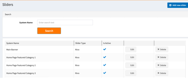
In order to create a new slider go to Plugins >> Anywhere Sliders >> Manage Sliders.
Click on the Add new slider button
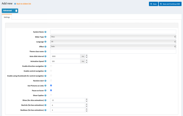
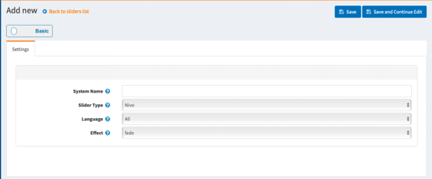
When you click the "Add new slider" button the following page will be opened. You can choose from three main slider types - a Nivo slider, a normal carousel 2D slider or a new 3D carousel slider.
NIVO SLIDER GENERAL SETTINGS
1. System Name -
2. Slider Type -
3. Language -
4. Effect - From here you choose what effect your Nivo Slider will have.
5. Theme class name - The name of the theme class that is added to the slider. For example, if you set it to light then an additional class named theme-light will be added to the slider.
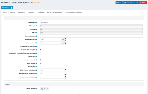
NIVO SLIDER ADVANCED SETTINGS
1. System Name -
2. Slider Type -
3. Language -
4. Effect - From here you choose what effect your Nivo Slider will have.
5. Theme class name - The name of the theme class that is added to the slider. For example if you set it to light then an additional class named theme-light will be added to the slider.
6. Auto slide interval (milliseconds) - The interval in milliseconds before an image is changed with another.
7. Animation Speed (milliseconds) - From here you can choose the slide transition speed.
8. Enable direction navigation - Enable or disable Next and Prev navigation.
9. Enable control navigation - Enable or disable control navigation (e.g 1,2,3...)
10. Enable using thumbnails for control navigation - Enable or disable using thumbnails for control navigation.
11. Random start - If checked the slider will start sliding from a random picture.
12. Use Pictures as Links - If checked the used pictures will act as links. They will redirect the user to a different page when clicked.
13. Pause on hover - If checked the slider will stop on mouse hover.
14. Show Caption - If checked the caption text for each image will be shown. You can add caption for your images from the Pictures tab by editing the picture and adding your content in the Title field.
15. Slices (for slice animations) - Number of slices displayed in the slice animations. Increasing the number of slices makes the transition between pictures smoother.
16. BoxCols (for box animations) - Number of box columns in the box animations. Increasing the number of box columns makes the transition between pictures smoother.
17. BoxRows (for box animations) - Number of box rows in the box animations. Increasing the number of box rows makes the transition between pictures smoother.
ADDING PICTURES TO A SLIDER
Once you have a new slider created you can upload images that will be used in the slider.
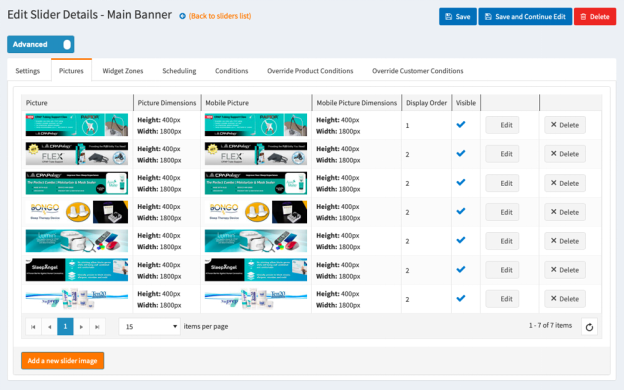
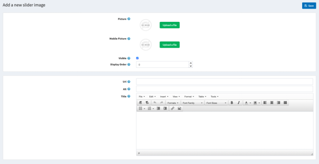
To add a picture to the slider with additional data that will be used by the slider as url, display text, alternate text, click the Add a new slider image button and a new page with a detail information for the slider image will be opened.
1. Picture - From here you can choose a picture from your computer and upload it.
2. Visible - Specify whether this image will be visible.
3. Display Order - The display order of the image. 1 represents the first slider image.
4. Title - The text which will be shown when the mouse hovers the image.
5. Url - The URL to which the image will redirect.
6. Alt - The image alt attribute (alternate text )
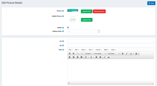
EDIT SLIDER PICTURE DETAILS
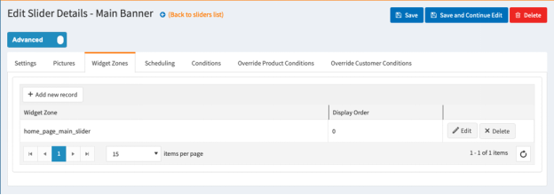
ADD THE SLIDER TO A WIDGET ZONE
From the Widget Zones you could choose the locations in which you want your slider to appear in your public store.
If you want to add the slider to widget zones, click the Add New Record button and from the drop-down select your desired widget zone.
Optionally specify a display order.
Note: Select home_page_main_slider - for the home page top main banner.
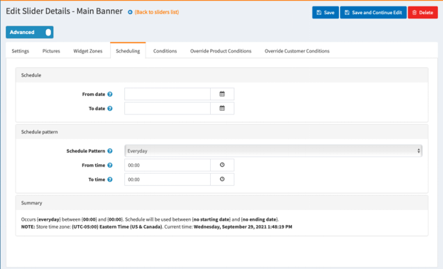
SLIDER SCHEDULING
From the Scheduling tab you could choose how long your slider will be active, and you could choose a time pattern to repeat and activate your slider.
SLIDER CONDITIONS
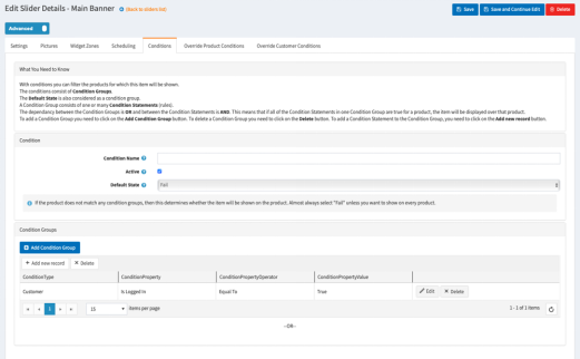
In the Conditions tab you can specify conditions for the current slider. If the conditions are met, the slider will be shown.
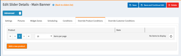
OVERRIDE PRODUCT CONDITIONS
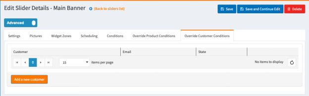
OVERRIDE CUSTOMER CONDITIONS
***If you need additional assistance please reach out to your Project Manager.
Was this article helpful?
That’s Great!
Thank you for your feedback
Sorry! We couldn't be helpful
Thank you for your feedback
Feedback sent
We appreciate your effort and will try to fix the article